
List Formatting 関連の Microsoft Docs を見ていたところ、customCardProps の表示位置を設定できる directionalHint プロパティに、設定できる値が増えていました。
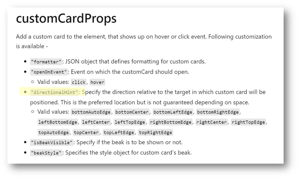
従来設定できた値は、次の通りです。
- bottomCenter
- leftCenter
- rightCenter
- topCenter
今回新たに設定できるようになった値は、次の通りです。
- bottomAutoEdge
- bottomLeftEdge
- bottomRightEdge
- leftBottomEdge
- leftTopEdge
- rightBottomEdge
- rightTopEdge
- topAutoEdge
- topLeftEdge
- topRightEdge
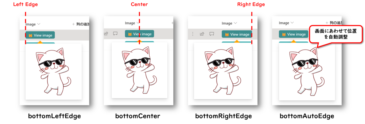
以下、directionalHint プロパティに、それぞれの値を設定してみたサンプル画像です。
directionalHint プロパティ 設定サンプル
bottom
left

right

top

サンプル画像作成に利用した書式設定のコード
上記サンプル画像作成のために、次の書式設定のコードを利用しました。23 行目の directionalHint プロパティの値を都度変更して、サンプル画像を作成しました。
{
  "$schema": "https://developer.microsoft.com/json-schemas/sp/v2/column-formatting.schema.json",
  "elmType": "div",
  "children": [
    {
      "elmType": "div",
      "txtContent": "😺 View image",
      "style": {
        "padding": "5px 10px",
        "cursor": "pointer",
        "border-radius": "5px",
        "font-size": "14px"
      },
      "attributes": {
        "class": "ms-bgColor-themePrimary ms-bgColor-themeDark--hover ms-fontColor-white"
      },
      "customCardProps": {
        "openOnEvent": "click",
        "beakStyle": {
          "background-color": "orange"
        },
        "isBeakVisible": true,
        "directionalHint": "leftTopEdge",
        "formatter": {
          "elmType": "div",
          "style": {
            "padding": "10px"
          },
          "children": [
            {
              "elmType": "img",
              "style": {
                "max-width": "200px"
              },
              "attributes": {
                "src": "=getThumbnailImage(@currentField, 400, 400)",
                "title": "[$Title]"
              }
            }
          ]
        }
      }
    }
  ]
}